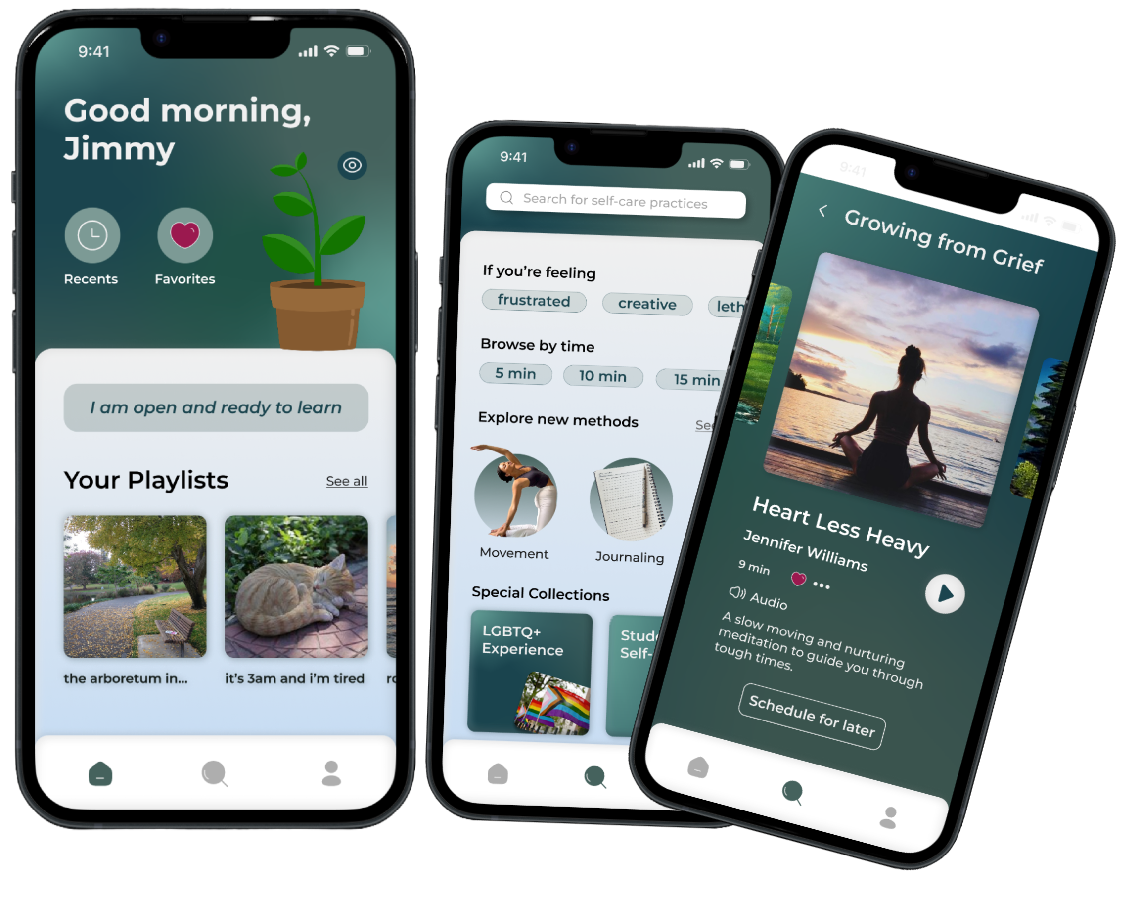
INTRODUCTION
This was a collaborative team project under Davis Design Interactive, a UX organization at my university. We were a 4-person design team under a peer mentor. I worked with my fellow designers and was sprint lead for research and prototyping.
PROBLEM
Is there a HowToSelfCare.com?
In recent years, mental health has become a very popular hot topic. Students especially have been looking for ways to practice self-care. How might we effectively integrate technology into a user's self-care journey?
SOLUTION
The key is less screen time. No, seriously.
Balancing screen time is a very important factor in taking care of one's mental health. Instead of being 'The' solution, our solution acts as a supplementary tool in practicing self-care rather than the be-all end-all. Additionally, we took special care to design the app with reduced screen time in mind. We did so through the following:
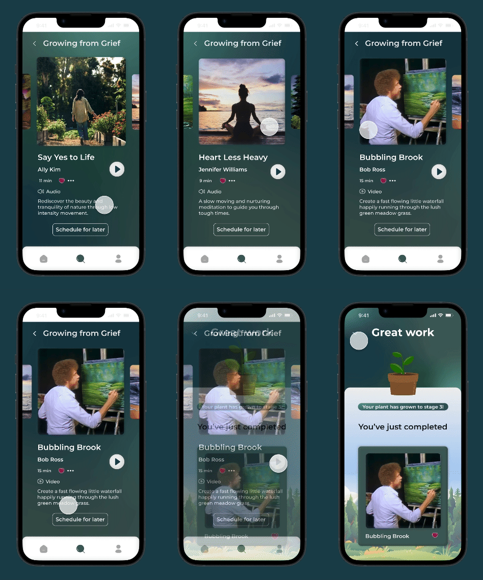
1) Video Activity Exercises
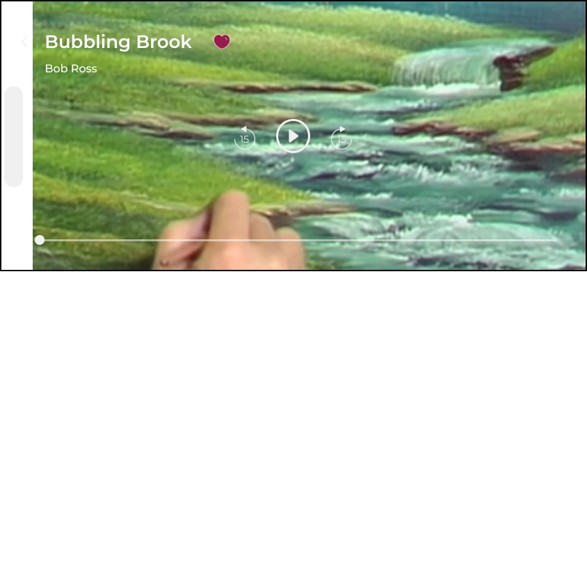
We wanted to promote doing something outside of our screens and thought providing examples of physical activities through guided video would be helpful.
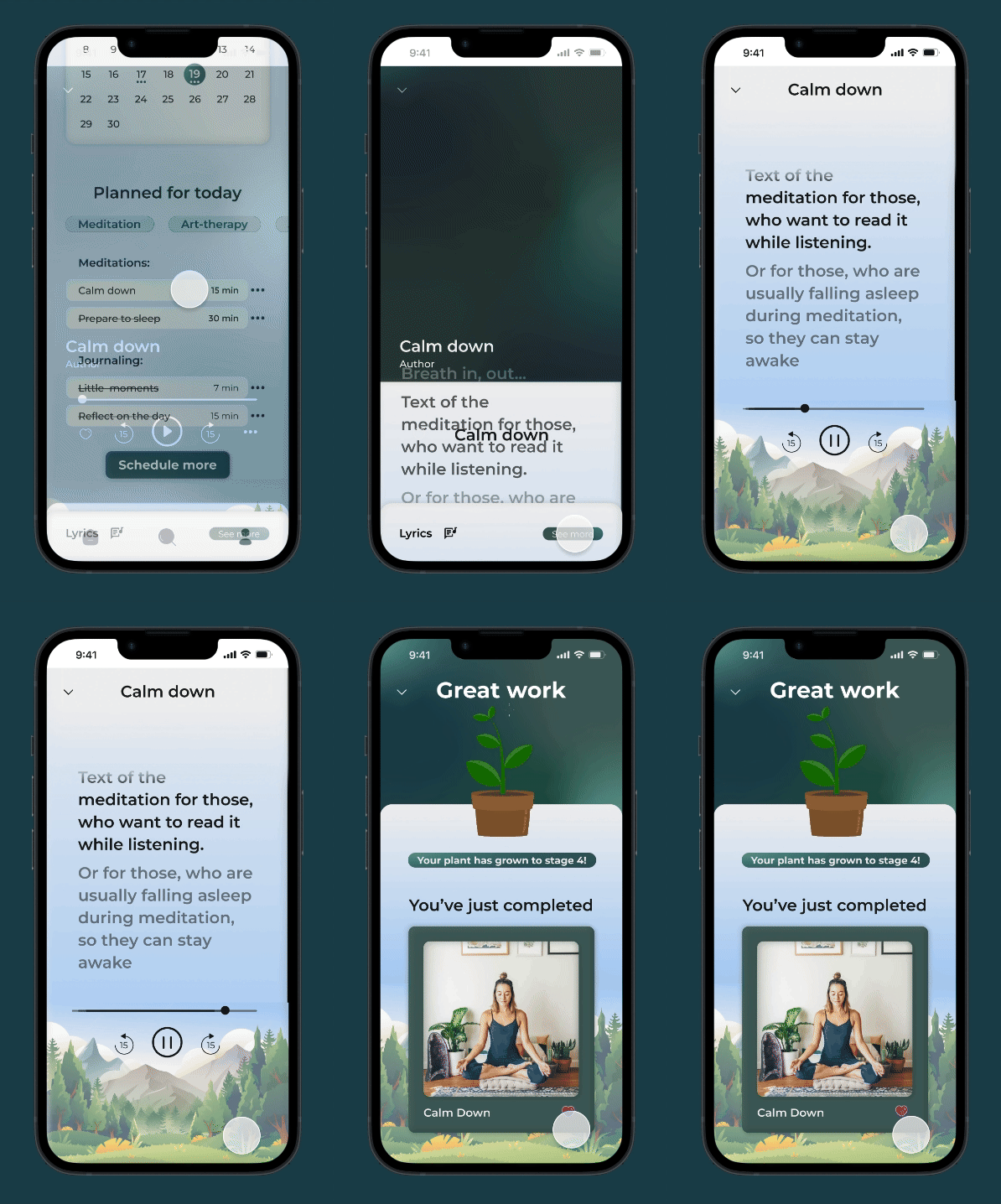
2) Audio Activity Exercises
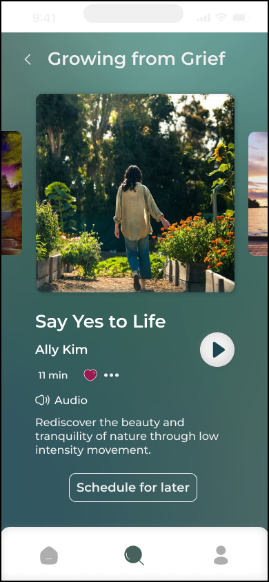
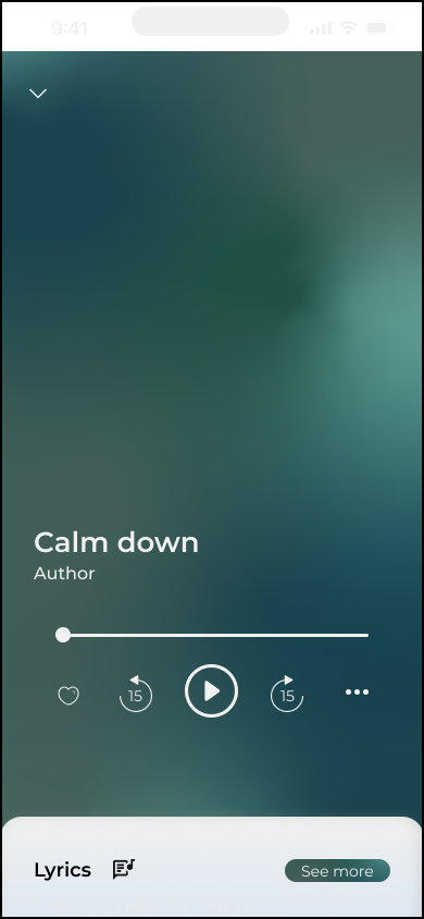
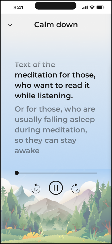
To take it a step further, we designed an audio UI to provide soundscapes for users and allow them to forgo looking at their screen altogether.
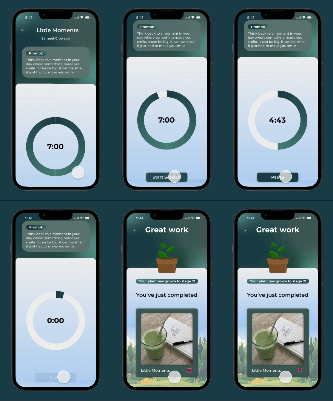
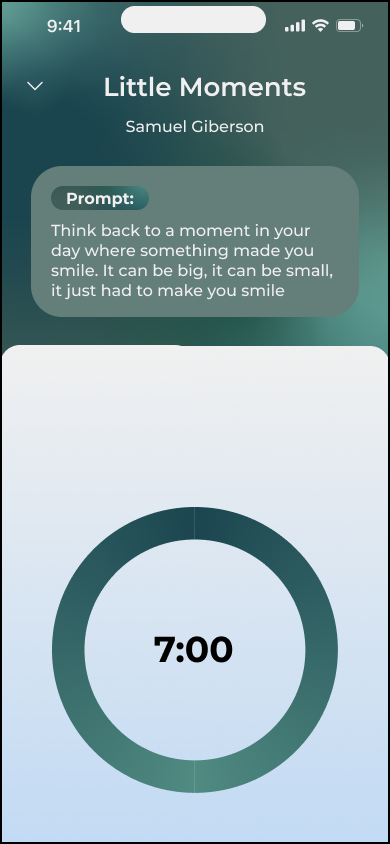
3) Time-Based Activity Exercises (100% Screen Free)
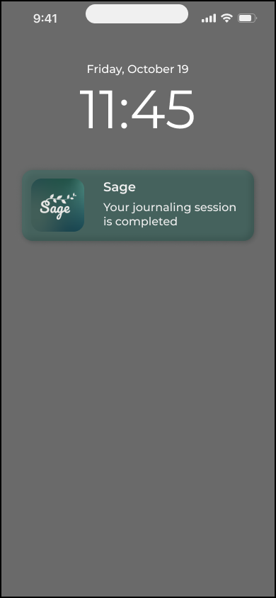
We used a timer system that would lock out users during an activity. This would allow them to really let themselves be in the moment.
RESEARCH
How do people practice self-care? What's the best way to do it?
Initially, we were prompted with coming up with an app solution to mental health. To do this, we first went about researching and approached our topic from multiple angles. On the user side, we conducted a survey and interviews to learn how people felt and approached mental health. We also dove into the literature of mental health and self-care and looked into various papers and studies on it. Lastly, we did some competitive analysis on self-care apps on the market.
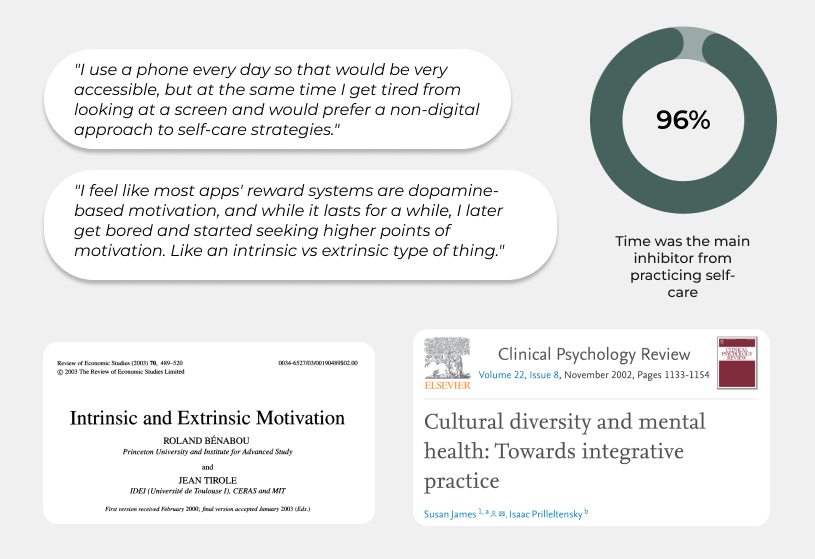
Something interesting that came up from almost all of our different sources was this desire for less screen time. This caused us quite the conundrum as we were designing an app, the very epitome of screen time. It was at this point that we realized we had to pivot.
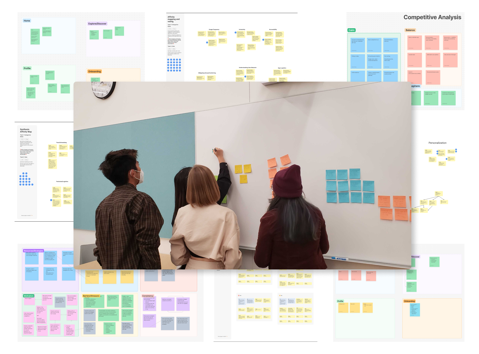
After many many (so many) rounds of affinity mapping, we began to form a solution. Instead of making an app for self-care, we would make an app that would help provide resources to practice self-care. With these insights in mind, we distilled the rest of our user research into these user personas which would guide us as we headed for our new goal.

DESIGN
Designing screens even when you want to reduce screens
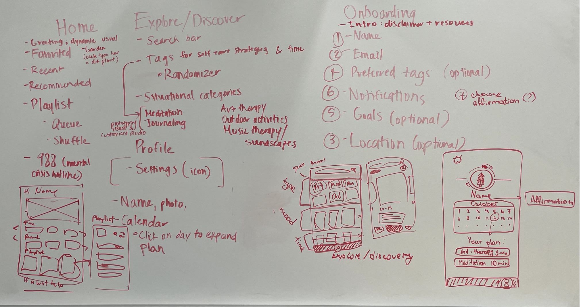
With our new goal in mind, we made some quick low-fidelity wireframes structuring out our app concept. After this we divided the main sections amongst ourselves where I focused on the Home Page.
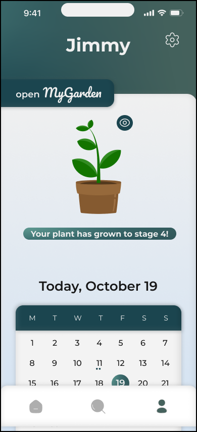
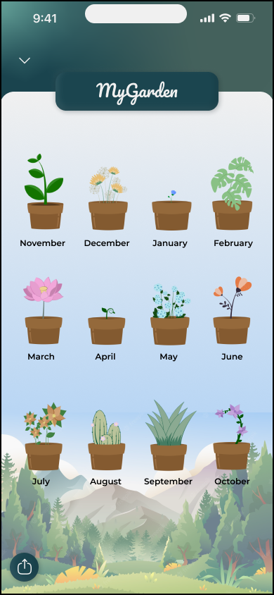
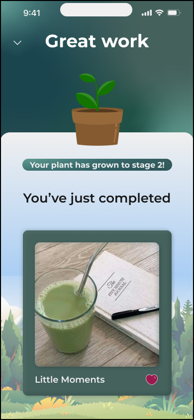
Additionally, we all had the idea of extrinsic vs intrinsic motivation on our minds as per our research. During ideation we came up with the concept of a little plant buddy as inspired by other self-care apps.
At this stage we also began ideating our reduced screen activities, eventually deciding on making use of video, audio and timers as previously mentioned.
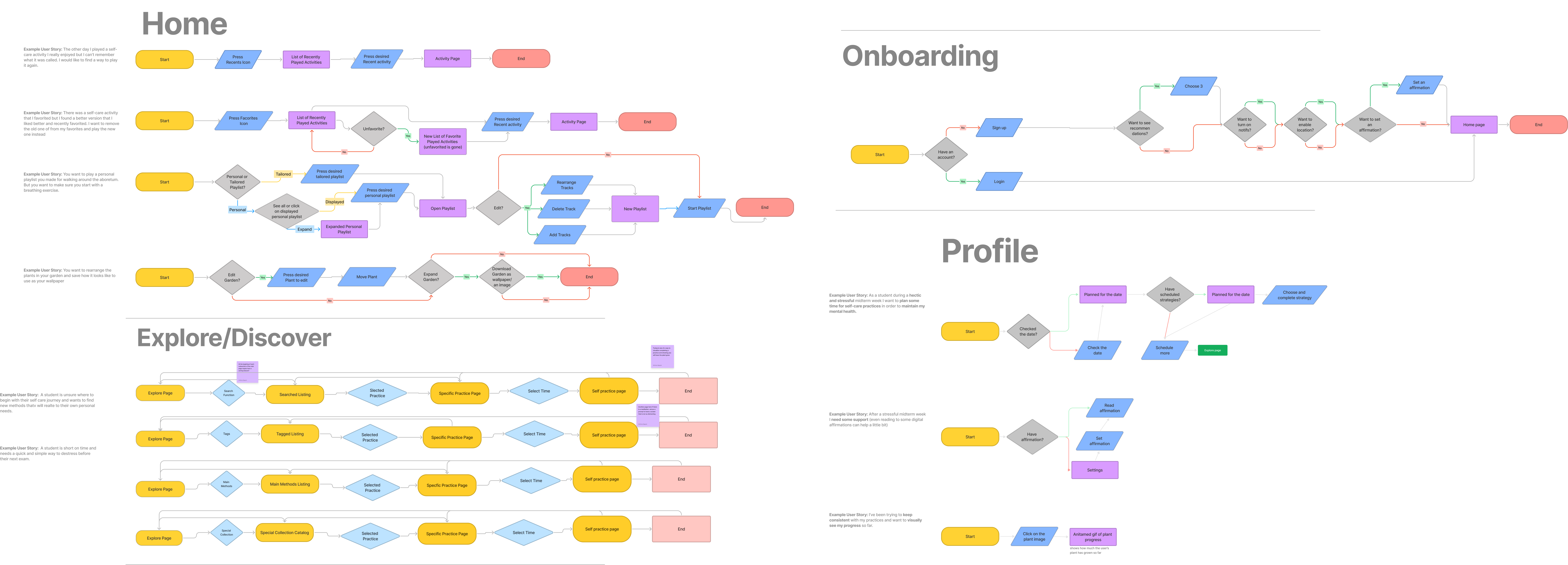
We then created user flows for each of our sections as well as a list of tasks we eventually wanted to test later during usability testing.
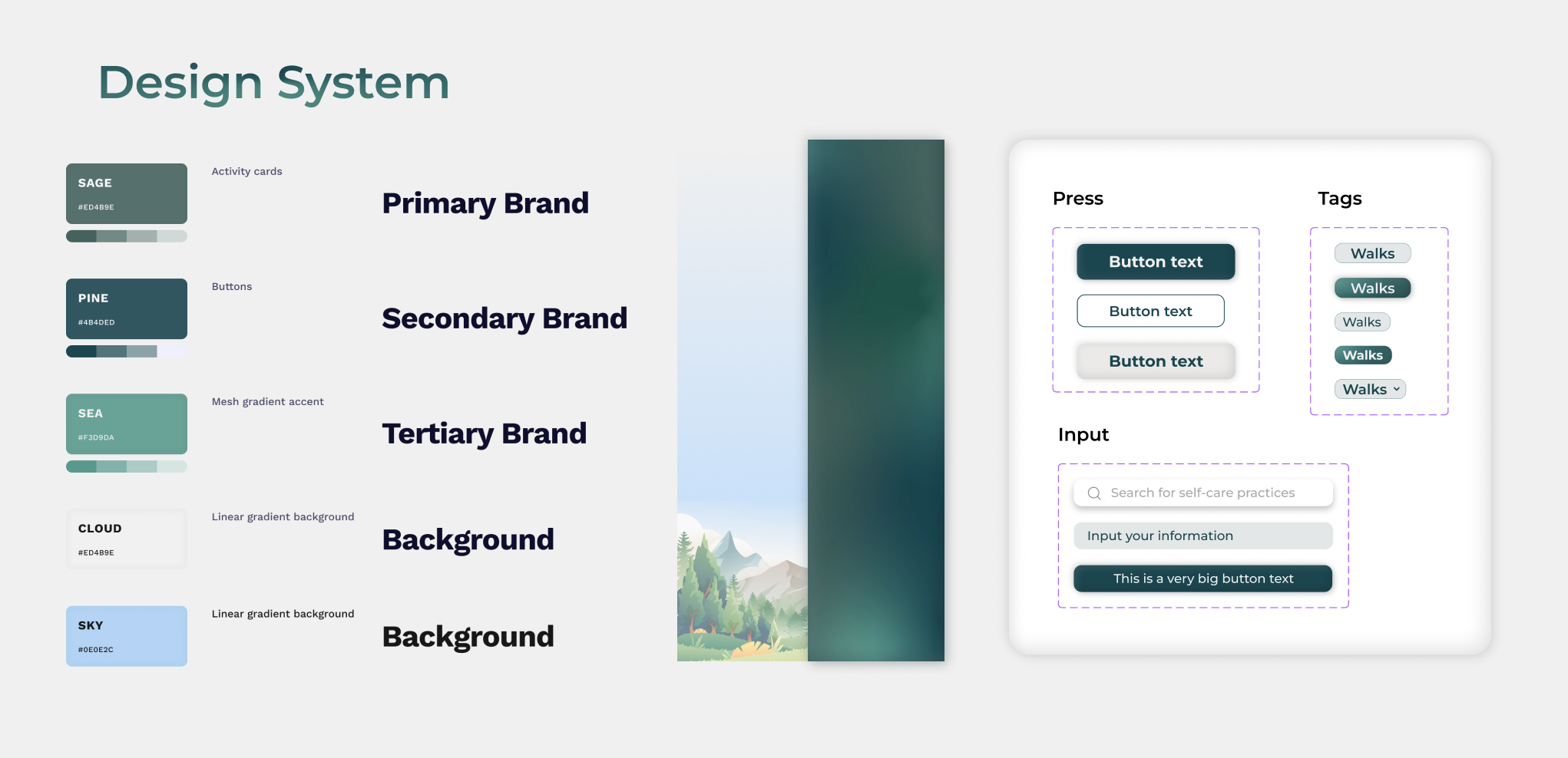
As we worked on our mid-fidelity designs, we began honing in on our branding and visuals. We eventually decided to move forward with our nature theme to both match the plant buddy and create a relaxing atmosphere. We decided to go for a more earthy color palette and soft shapes.
USABILITY
Where to 'Home' our Plant Buddy?
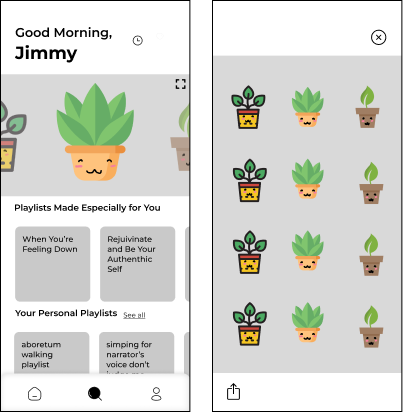
We had 2 rounds of usability testing and one of the main issues that came up was confusion between the 'Home' and 'Profile' section. Their purposes overlapped quite a bit and the plant buddy seemed like too personal a feature to have in the home section.
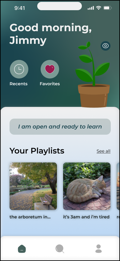
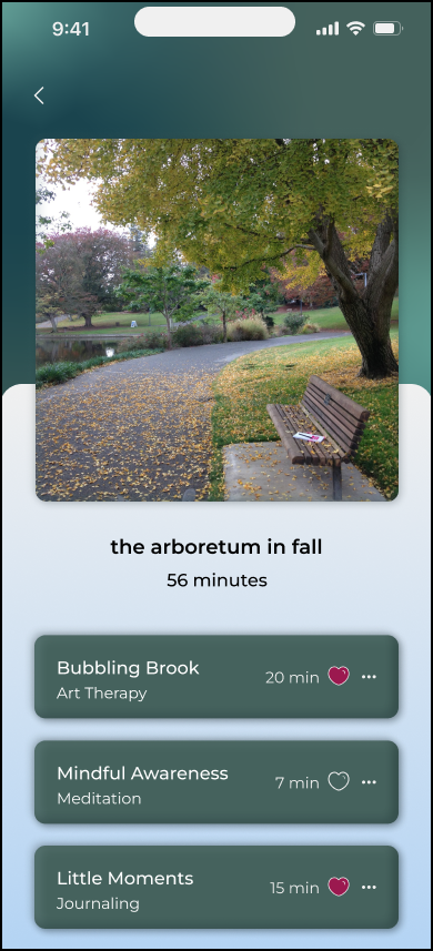
We decided to make the separation more clear between the two sections and specified the 'Profile' for items personal to the user and the 'Home' for a general feed page with curated playlists and collections.
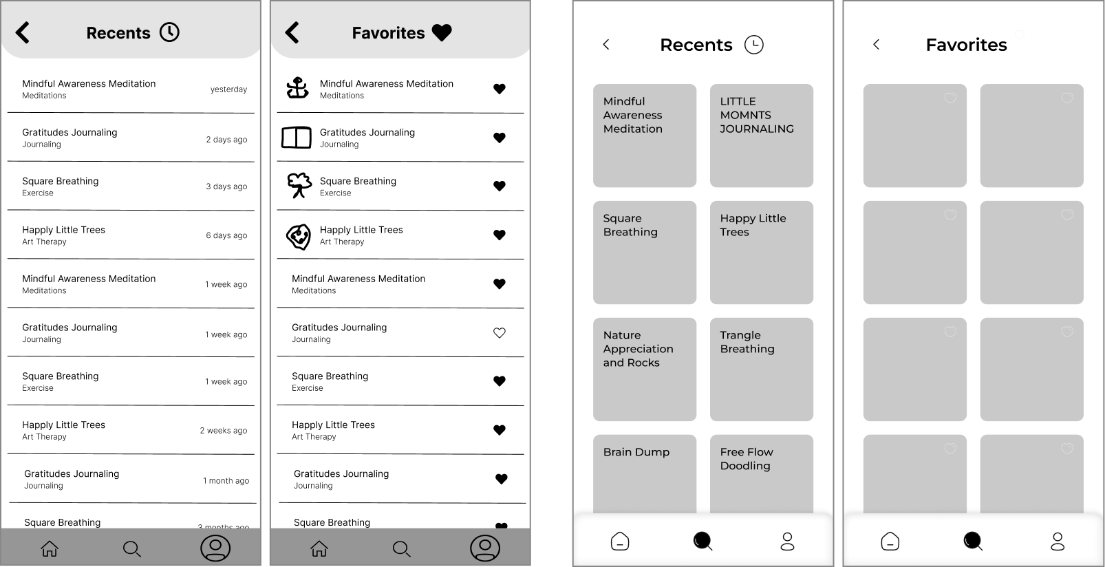
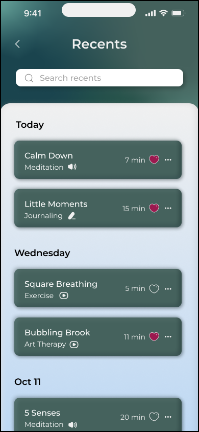
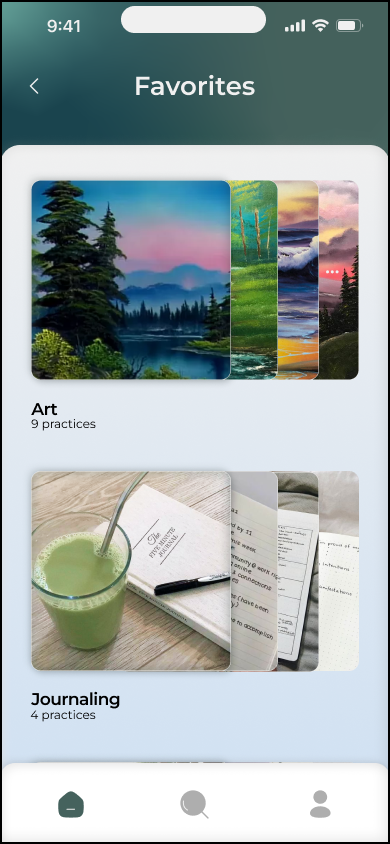
Another issue that came up which was more specific to the pages I worked on were how the 'Recents' and 'Favorites' looked too similar and general confusion between the two.
I created several iterations for how they would look, eventually using aspects of previous designs to better differentiate the too. I ended up having the 'Recents' page follow a more sleek design while having the 'Favorites' use cards.
FINAL PROTOTYPE
Screenless (Substantially) Self-care with Sage!
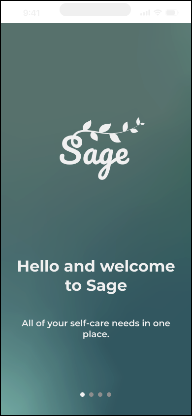
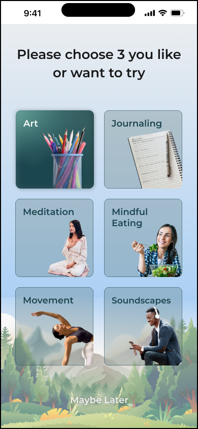
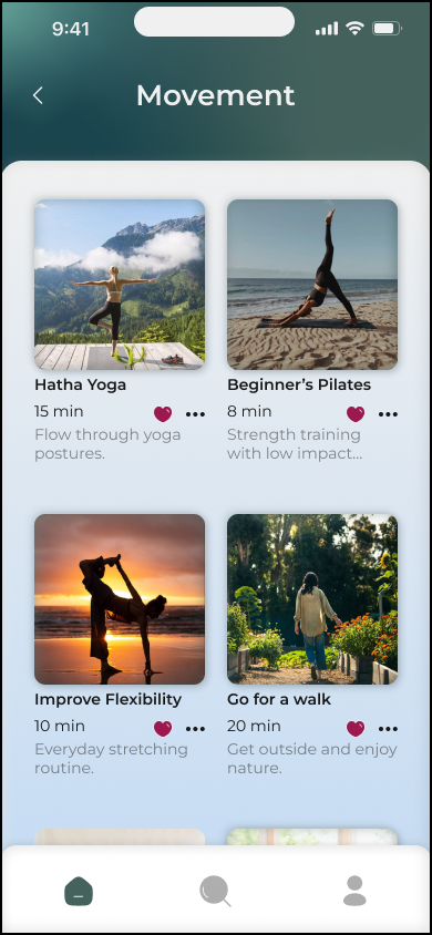
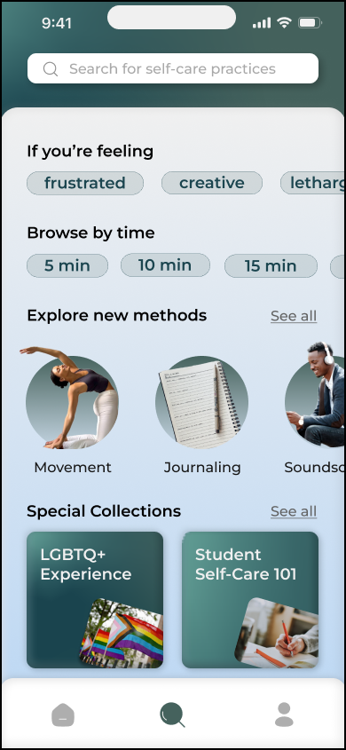
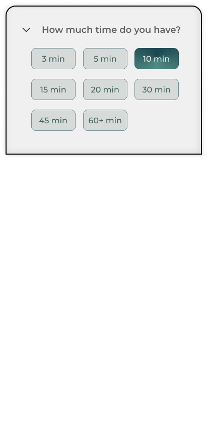
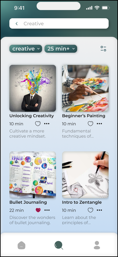
Finally, we started on our final prototype and high-fidelity mock-ups. We wanted the design to feel and look as clean as possible. We really honed in on the UX experience here by really paying attention to small details and microinteractions as well as adding some fun animations. Here are the results:
Onboarding

Home Pages
Explore Pages
Profile Pages
Activites
Check out the Figma Prototype here!
REFLECTION
When in doubt, always look back at the research
This project really helped me focus on the user experience (UX) side of UI/UX. By focusing more on it, I gained a greater appreciation for user research. Whenever we came across a roadblock in our designs, we would always turn back to the research to help us puzzle it out. Additionally, I enjoyed creating meaningful microinteractions and learned a lot about what is the most smooth for users and what’s jarring and takes them out of the entire experience.
It was also such a fun and challenging prompt since mental health as a whole is such a complex issue but I’m glad my team was able to tackle it quite effectively, even winning the award for Best UX Research and Most Innovative UX. I think in the future I would want to explore other features that would make the entire app more personal for the user.


