INTRODUCTION
This was a cross-functional team project under CodeLabs Davis, a software and design organization at my university. We were a 10-person team consisting of a project manager, 6 developers and 3 designers. I acted as one of the UI/UX designers researching, iterating and designing the product before acting as a usability consultant to the developers after hand-off.
PROBLEM
To eat or not to eat… ‘Where?’ is the question!
Young students eating out often suffer from choice paralysis and have a hard time deciding where to go, especially when eating out in groups. How might we make the act of deciding what restaurant to go to much more efficient and hassle-free?
SOLUTION
Smash or Pass: Restaurant Edition
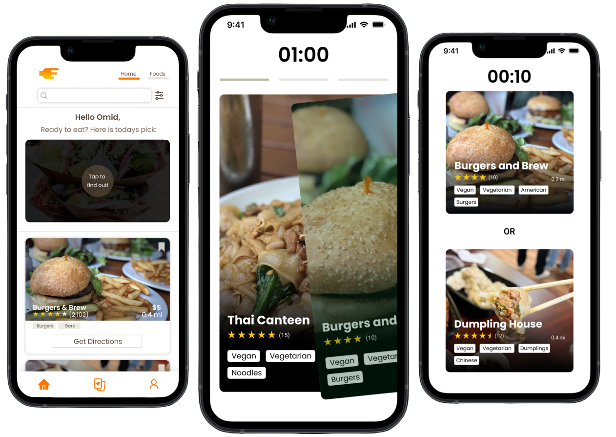
Our solution was to create an app that essentially decides for you after gaining some input in a fun way. Making use of dating app models, we gamified the decision-making process to create a more engaging experience.
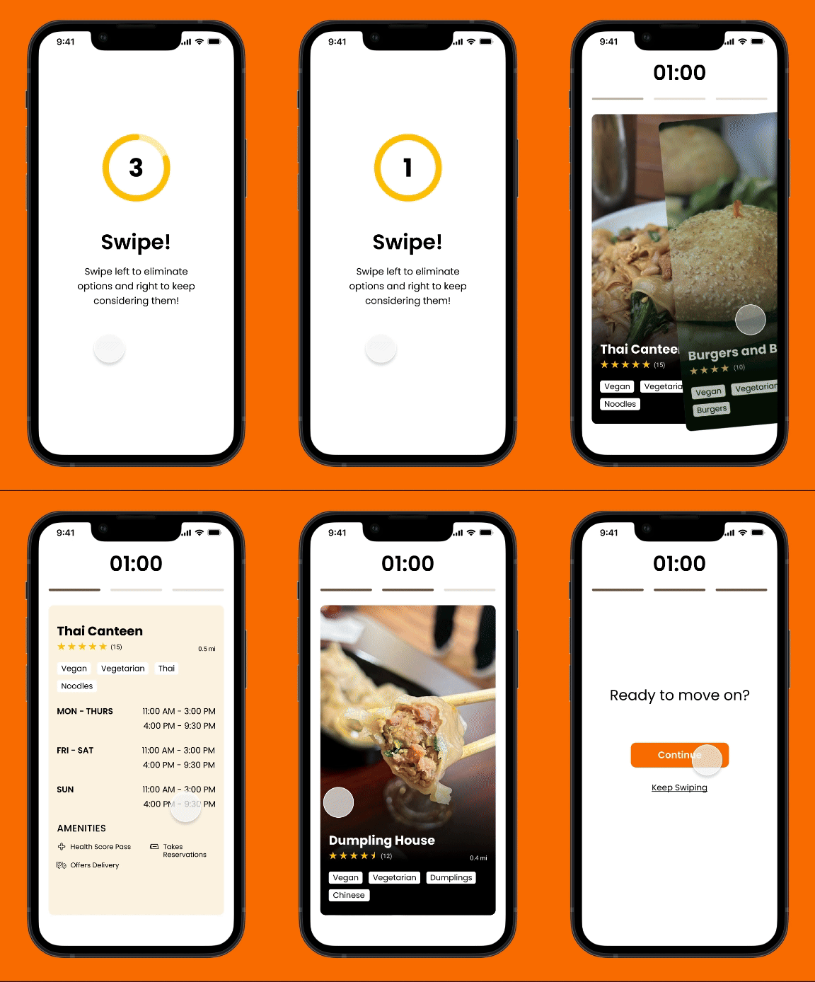
1) Swipe ‘Yes’ to Restaurants you’re feeling and ‘No’ to ones you’re not. The app takes notes on your preferences.
This allows for a more fast and convenient way to make choices.
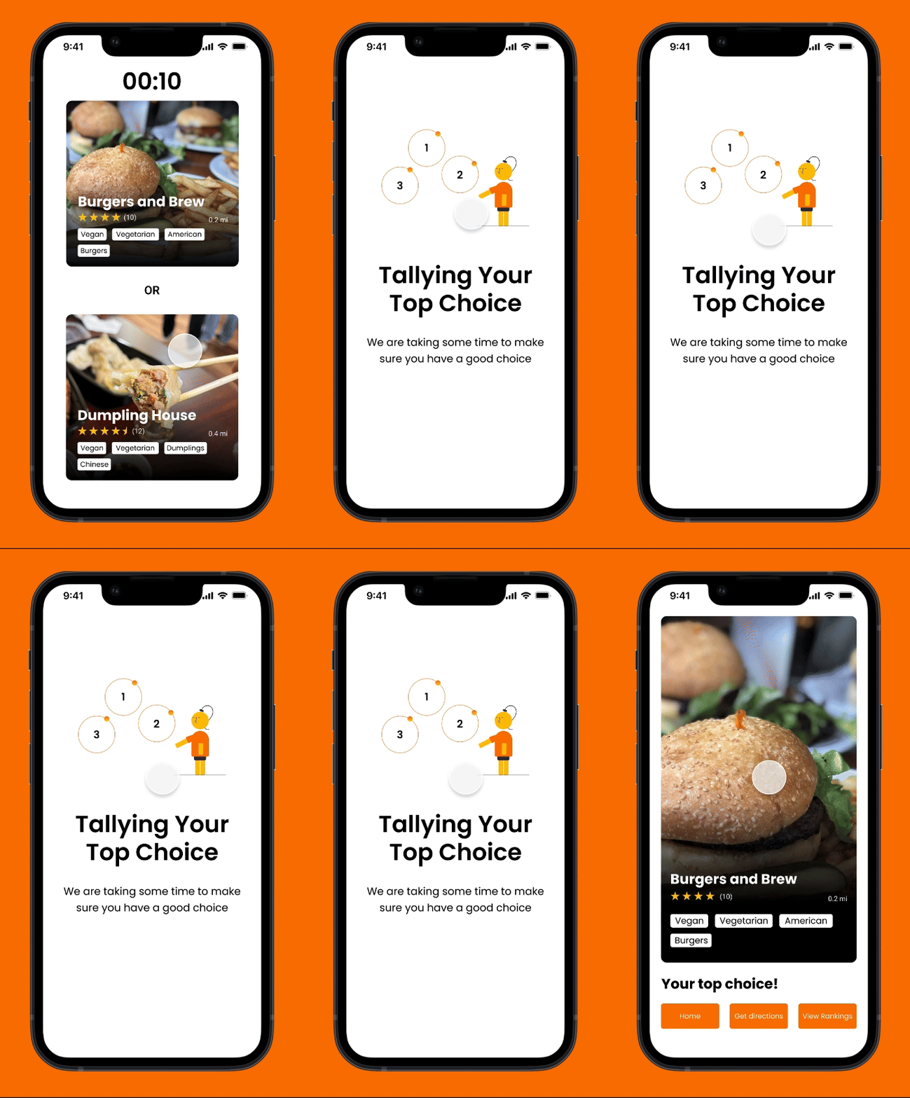
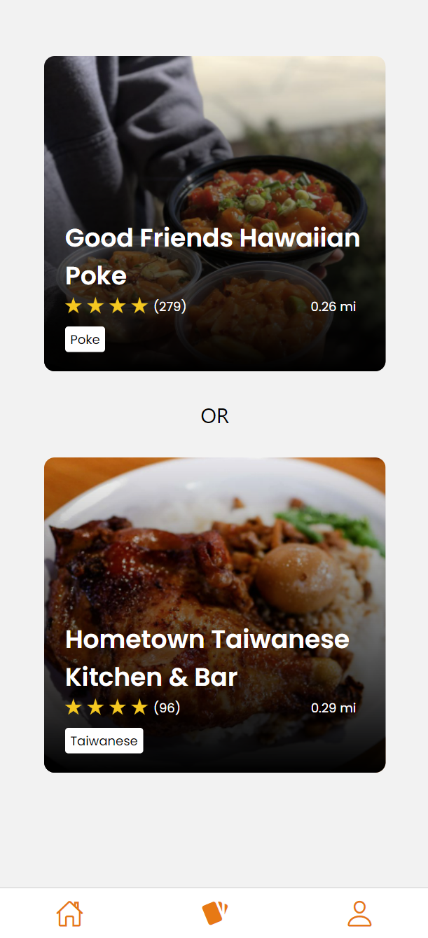
2) With your preferences tallied up, pick between this or that.
This ensues in a fun restaurant battle royale where your top picks get narrowed down.
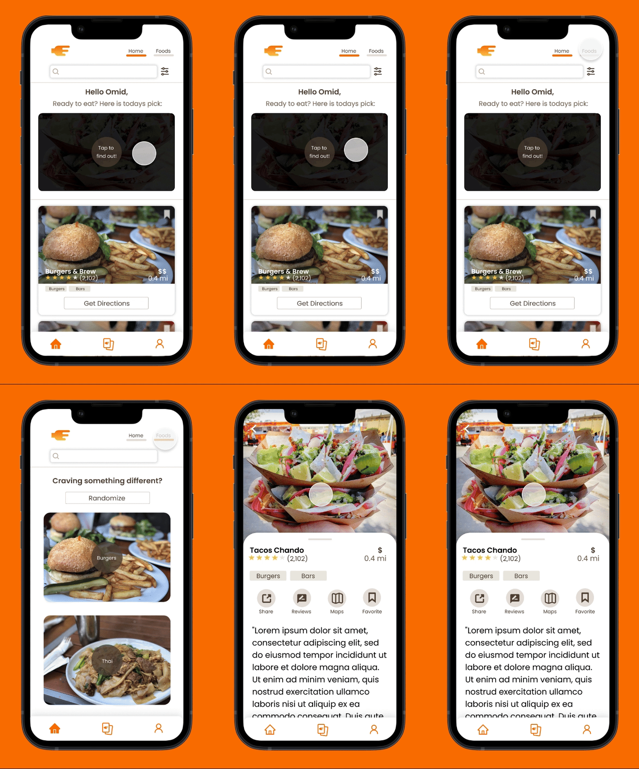
3) Still can’t decide? Pick the randomize button and have the app truly decide for you.
This makes use of a user's location data and Google and Yelp API to recommend nearby restaurants.
RESEARCH
How do people currently decide on where to eat?
Before arriving at our solution we first had to figure out how exactly UC Davis students were deciding on where to eat. To do so, we used a 3-pronged approach and collected data from users in 3 ways: Surveys, Interviews and Task Analyses. This allowed us to have a varied amount of both qualitative and quantitative data.
From the research we gathered we did some affinity mapping and came up with the following insights:
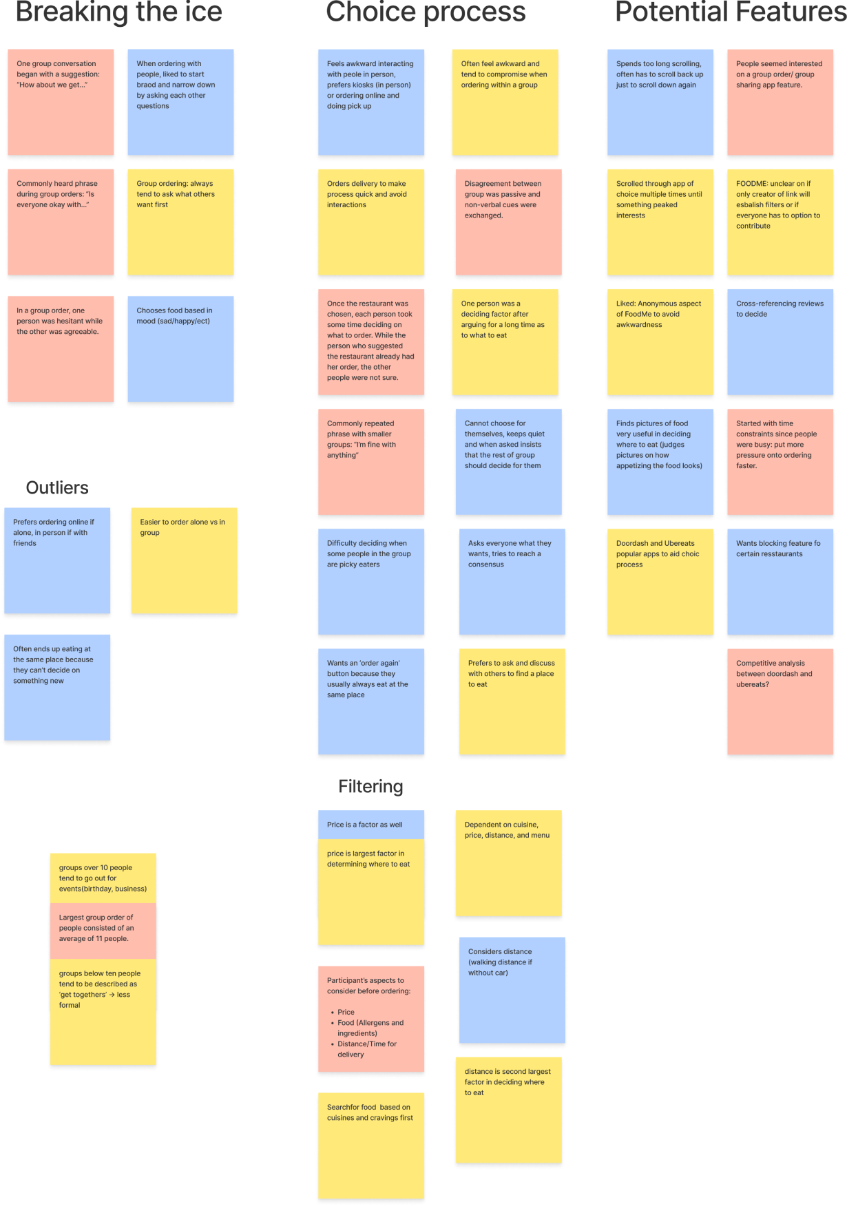
- Group settings were the hardest when it came to deciding on food. Many people were interested in making that process smoother.
- Many different people considered many different variables, there wasn't much overlap.
- Except for distance and pricing. This was something that most people prioritized.
- Overall desire to reduce decision-making time. Wanted incentives to pick a place quicker but cautioned about types of motivation
From these insights we distilled that information down into the following personas which we then presented to the developers.
- Solo Persona - Concerned mainly over price and place, values convenience
- Group Persona (Aggressive) - Has strong opinions. Gets caught up in their own desires over the group
- Group Persona (Hesitant) - Too shy to voice out opinions. Finds it difficult to contribute to the discussion

IDEATION
How can we make decision-making more digestible?
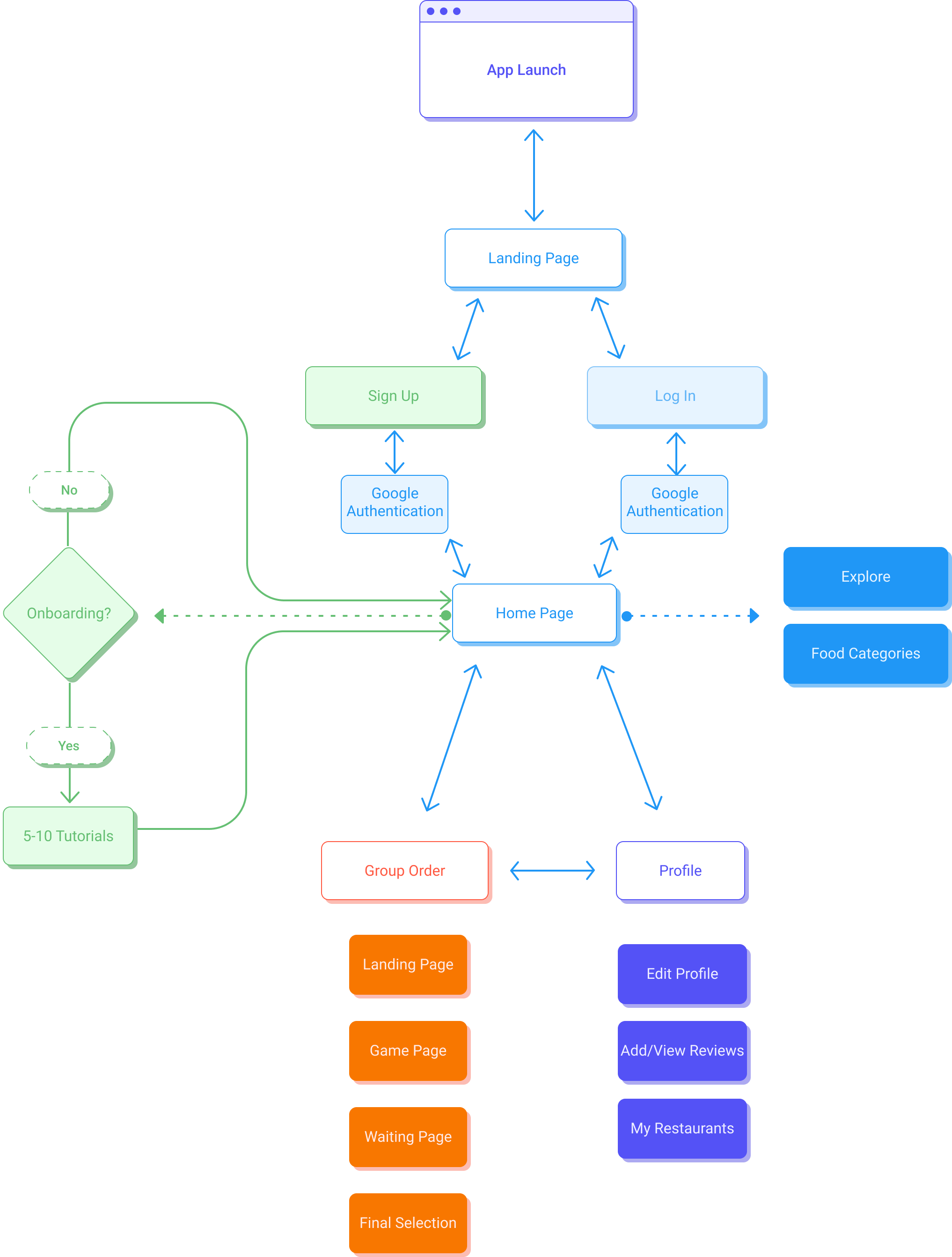
Together with the developers, we brainstormed and discussed various features and goals we had for the app. We then voted on the most important ones and eventually created the following user flow.
Around this time, we also began to toy with the idea of gamification within our app as it was brought up during the meeting. We thought it would be a good way to diffuse friction in group decision-making while also being fun.
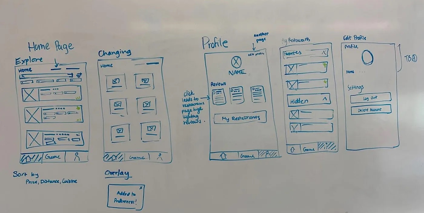
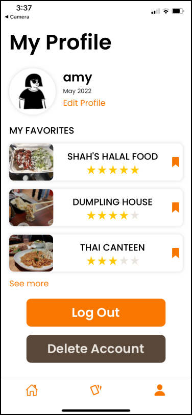
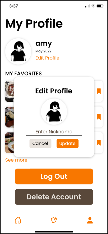
In the following weeks, us designers met up to hash out the specifics of the screens we wanted and made some quick low-fidelity wireframes. We allocated different sections amongst ourselves to create mid-fidelity designs for. Additionally, we did some complementary literature review on gamification as well as some competitive analysis on other food apps. I mainly took charge of the Profile page.
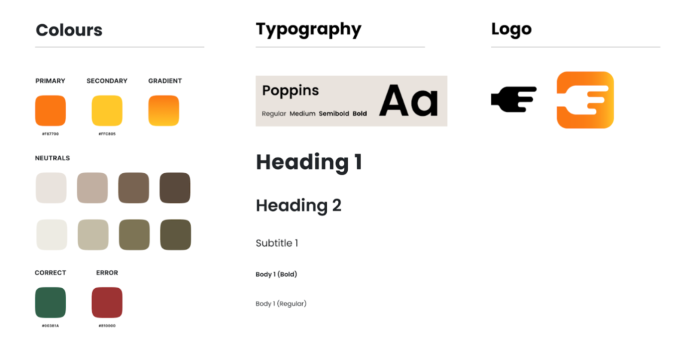
We also came up with a rough branding guide, deciding to opt for warmer colors and rounded edges to give our app a friendly and inviting feel.
ITERATION
It can always be better. Also, coding takes a loooong time.
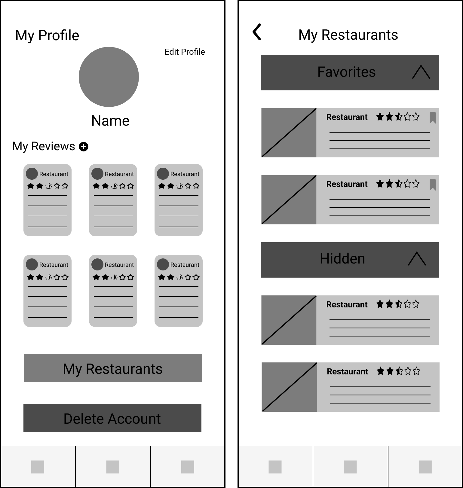
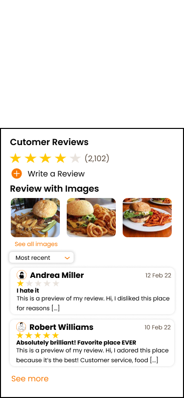
These were some of my first iterations of designs. Some feedback I received was how overall tight and condensed everything felt. As this project developed I looked into ways to open up the design more and really call back to that inviting atmosphere we were aiming for. For example, I eventually changed the narrow review sections for wider ones.
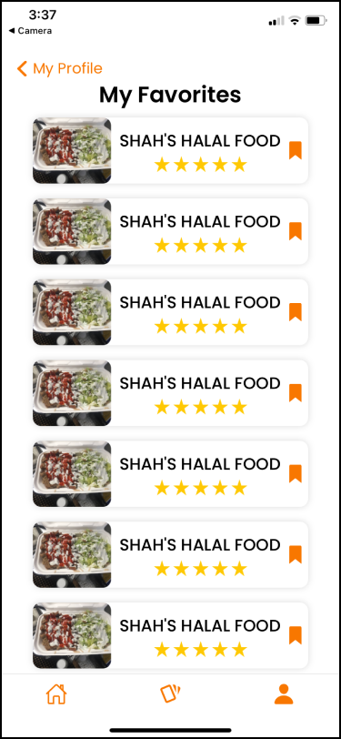
Additionally, due to time constraints and some setbacks for the developers, I had to scrap some of my designs and rework the page to accommodate what the developers reasonably had time to code. I ended up prioritizing the 'Favorites' section of the app and had to put 'Recents' on hold.
DEVELOPMENT
Time to Hand-Off Food-Off
Finally, it was time for the hand-off. Throughout the rest of the project, I worked closely with the developers to help implement their designs. I think they did a pretty good job, here they are:
Onboarding
Hi-Fi Designs
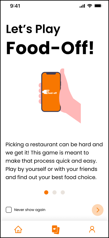
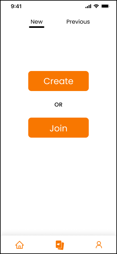
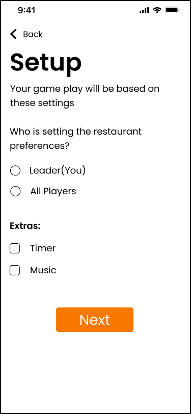
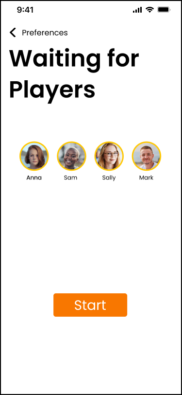
Developer Screens
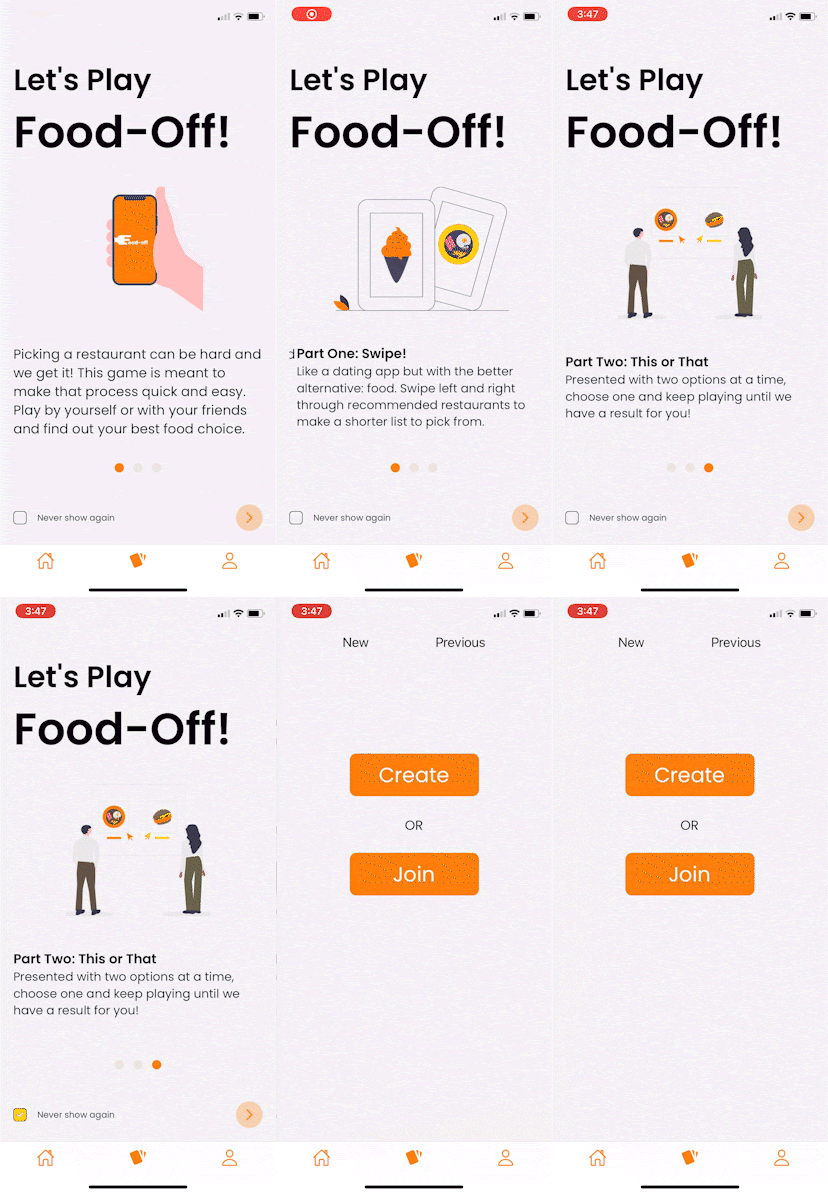
Gameplay
Hi-Fi Designs
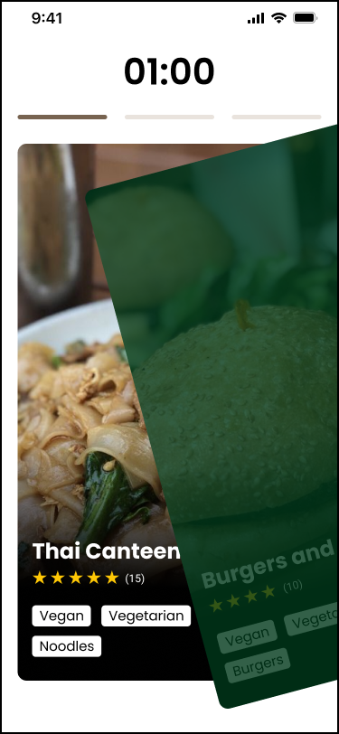
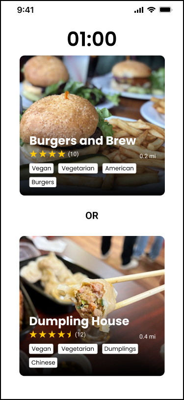
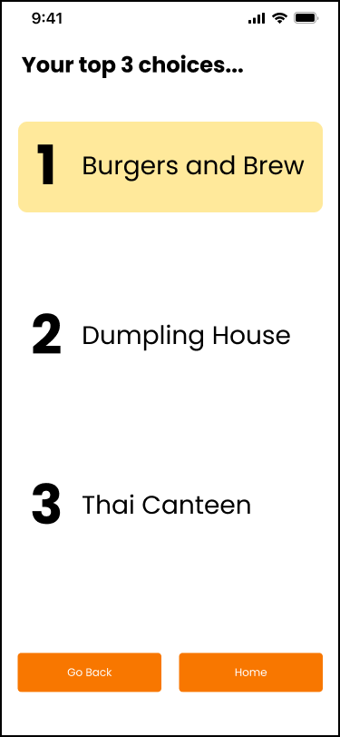
Developer Screens
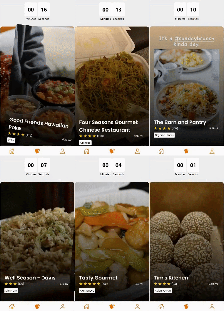

Profile Page
Hi-Fi Designs
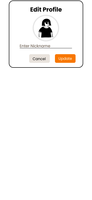
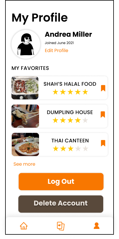
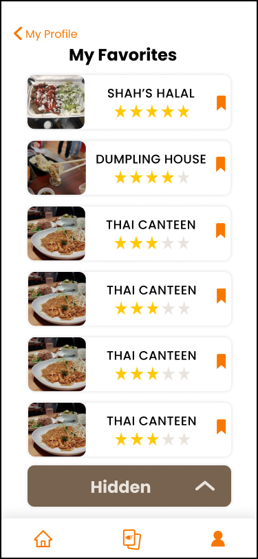
Developer Screens
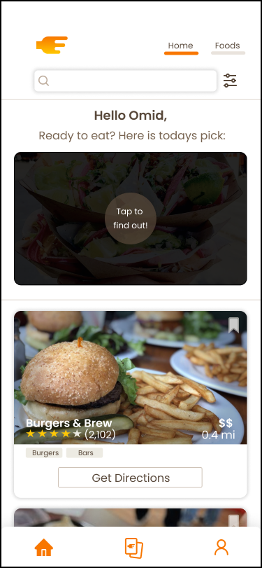
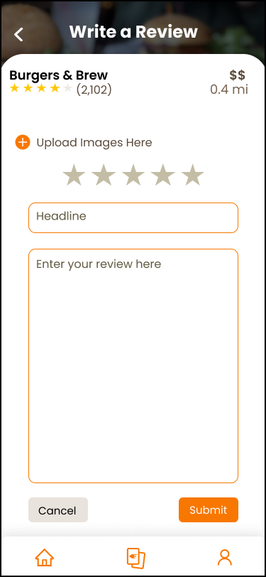
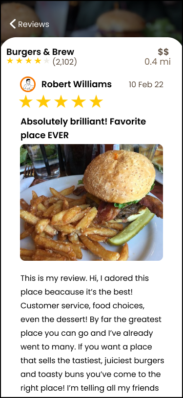
While there was no time to implement them, the following screens were designed for potential future use. I personally worked on the Review Pages.
Home Page
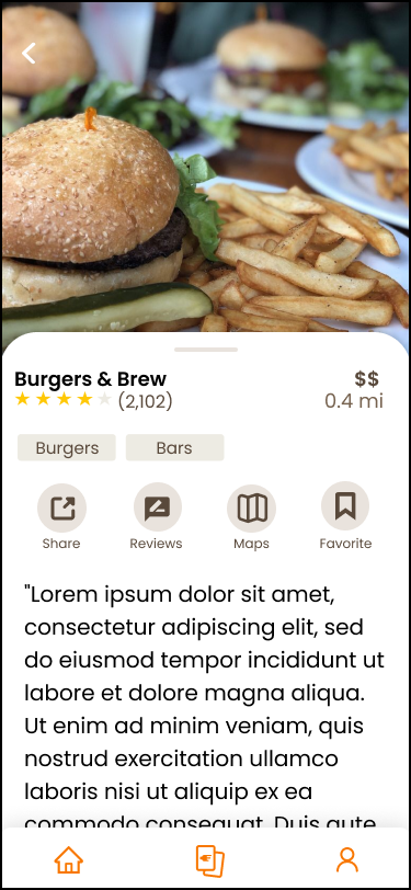
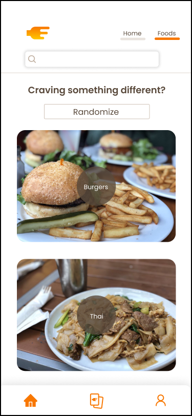
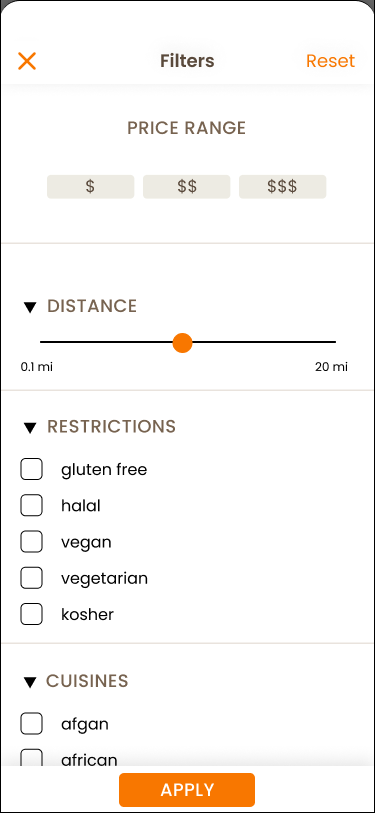
Reviews
Check out the Figma Prototype here!
REFLECTION
Desiging with code in mind...
This project was my first real foray into UI/UX design and I’m very grateful to it for really teaching me the entire UI/UX process. It also helped me learn to be very flexible with my design and project goals as I had to work together with the developers to ensure the final product could be developed in time. Working on a cross-functional team was also a very valuable experience as I had to be very mindful of designing with their coding capabilities in mind.
For next steps, I would have liked to implement the recents feature for the profile page and the reviews system. In the future I would like to do more usability testing.


